Seaborn is a Python data visualization library that is built on top of the popular Matplotlib library. It provides a high-level interface for creating informative and attractive statistical graphics. Seaborn is designed to work well with data frames from the pandas library and is particularly suited for visualizing relationships between multiple variables.
Seaborn offers a wide range of visualization techniques, including univariate and bivariate plots, categorical plots, matrix plots, and time series plots. It provides a simple and intuitive API to create visually appealing plots with minimal code. Seaborn also offers built-in themes and color palettes that can be easily customized to match the desired style or aesthetic.
One of the key features of Seaborn is its ability to create statistical visualizations that are often used in exploratory data analysis and data science projects. It provides functions to plot various types of statistical estimates, such as scatter plots, regression plots, kernel density plots, box plots, and violin plots. These plots can help reveal patterns, trends, and relationships in the data.
Overall, Seaborn is a powerful and flexible data visualization library in Python that is widely used for creating visually appealing and informative plots for data analysis and presentation purposes.
Importance of it
Seaborn is an important library in the Python data science ecosystem for several reasons:
- Enhanced Visualization Capabilities: Seaborn provides a higher-level interface compared to Matplotlib, making it easier to create visually appealing and informative plots. It offers a wide range of built-in plot types and styles, allowing for the creation of complex and sophisticated visualizations with minimal code.
- Statistical Visualizations: Seaborn specializes in statistical visualizations, providing functions to plot various statistical estimates. It allows users to easily create scatter plots, regression plots, distribution plots, and more. These visualizations help in understanding the underlying patterns, trends, and relationships in the data.
- Integration with Pandas: Seaborn seamlessly integrates with the popular data manipulation library, pandas. It can directly work with pandas data frames, making it convenient for data analysis tasks. This integration enables users to visualize data from pandas data frames without requiring extensive data preparation.
- Customization and Styling: Seaborn offers a range of customization options to tailor plots to specific requirements. It provides built-in themes and color palettes that can be easily adjusted to match the desired style or aesthetic. Users can also customize plot elements such as axes, legends, and grids to create visually appealing and cohesive visualizations.
- Interactivity and Exploration: Seaborn supports interactivity through integration with other Python libraries such as Jupyter Notebook and IPython. This allows users to explore data interactively by manipulating plots, zooming in on specific regions, or inspecting data points. Such interactive capabilities facilitate data exploration and enhance the overall analysis experience.
- Community and Documentation: Seaborn has a strong and active community of users, which means there are ample resources and support available. The library is well-documented, providing detailed explanations and examples for each plot type and customization option. The community also contributes additional tutorials, blog posts, and code snippets that further enhance the learning and usage of Seaborn.
How is it used
Seaborn is used in Python for various data visualization tasks. Here are some common use cases and examples of how Seaborn is used:
- Exploratory Data Analysis (EDA): Seaborn is often employed during the initial stages of data analysis to explore and understand the data. It helps in visualizing the distribution of variables, identifying relationships between variables, detecting outliers, and spotting patterns or trends.
Example: Creating a histogram or a kernel density plot to visualize the distribution of a numerical variable in a dataset.
- Statistical Estimation: Seaborn provides functions to create statistical plots that estimate and display relationships between variables. These plots can include regression lines, confidence intervals, or categorical summaries.
Example: Generating a scatter plot with a regression line to examine the relationship between two numerical variables and assess the strength and direction of the relationship.
- Categorical Data Visualization: Seaborn offers various plot types to visualize categorical data, such as bar plots, count plots, and box plots. These plots help compare and analyze different categories or groups within a dataset.
Example: Creating a grouped bar plot to compare the average values of a numerical variable across different categories.
- Multi-Plot Grids: Seaborn enables the creation of multi-plot grids, where multiple plots can be displayed together to analyze multiple variables or aspects of the data simultaneously.
Example: Constructing a pair plot or a heat map to visualize the relationships between multiple variables in a dataset.
- Styling and Customization: Seaborn allows for customization and styling of plots to match specific requirements. It provides control over plot aesthetics, color palettes, plot elements, and themes.
Example: Customizing the colors, fonts, and overall style of a plot to adhere to a specific visual identity or presentation style.
- Time Series Visualization: Seaborn supports visualizing time series data, such as line plots or heat maps, to analyze patterns and trends over time.
Example: Plotting a line graph of stock prices over time to observe the stock’s performance and identify any patterns or trends.
These are just a few examples of how Seaborn is used in practice. The library’s versatility and wide range of plot types make it a valuable tool for data visualization and exploratory analysis in various domains, including data science, machine learning, and statistical analysis.
Plotting Examples of seaborn
Here are a few examples of how Seaborn can be used to create different types of visualizations:
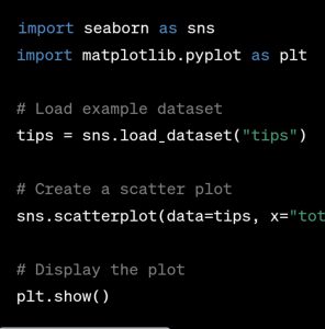
Scatter Plot:
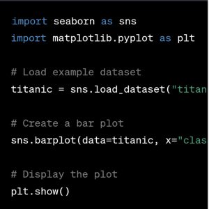
Bar Plot:
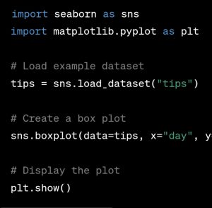
Box Plot:
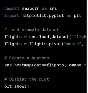
Heatmap:
In summary, Seaborn is important in the data science ecosystem due to its enhanced visualization capabilities, focus on statistical visualizations, integration with pandas, customization options, interactivity, and the support of a vibrant community. It helps data scientists and analysts effectively communicate insights and findings through visually compelling and meaningful plots.
Master Your Coding Skills with BootSelf AI
If you're looking to enhance your coding abilities and upskill in artificial intelligence, look no further than the BootSelf AI app. This innovative platform provides AI-based coding lessons that are tailored to your individual learning pace.
Available on both iOS and Android, you can download the BootSelf AI app and start mastering coding skills today: